
6 Unique Logo Designs for Medical and Healthcare Providers
If you look up “doctor office logo,” you’ll see a whoooole bunch of logo designs that incorporate stethoscopes and the first aid plus sign. Switch to “health and wellness,” and it’s lotus flowers galore.
The logo and branding for your health and wellness practice is more than just a symbol. It’s a powerful tool that helps you connect with best-fit clients. It allows you to convey a feeling and communicate everything you stand for before you even meet someone.
A strong logo should work for only your business. You shouldn’t be able to pop in any other business name and have the logo work just as well. So in the sea of stethoscopes and lotus flowers, you have a huge opportunity to stand out, grab your ideal client’s attention, and resonate with them deeply. And that can be the reason they choose to book an appointment with you over another provider.
At Amp’d Designs, while I absolutely love working with and learning about a variety of industries, I have designed quite a few logos and brand identities for health, wellness, and medical practices. It’s one of my favorite industries to collaborate with because I’ve personally explored my own wellness journey, and therefore have immense admiration for the intentional work that providers do.
Below, I’m sharing 6 of those strong, unique, values-driven healthcare logos that stand the test of time and help each business grow.
What makes a strong wellness logo and brand?:
Any strong logo has these core qualities: simple, memorable, relevant, versatile, and timeless.
The logo for your healthcare practice should be simple, clean, and easy to understand.
A memorable logo is unique and different, as opposed to blending into the sea of lotus flowers.
And with a versatile and timeless logo, your brand will grow with you over the years, without the need to constantly redesign every time you make a business shift.
Things to consider before designing a logo for your medical practice:
In order to hit the nail on the head with the logo qualities above, we begin your project with a deep conversation about your business. Some of the questions I ask during my branding process are:
What are your core values as a business owner?
What challenges are your ideal clients facing, and how do you help them overcome those challenges?
How do you want your clients to feel when they work with you?
If clients could get only one message about your clinic, what would you want it to be?
Your answers to these provide the solid foundation for a unique, strategic, intentional logo and brand design that communicates the right message to the right people, helping you grow your practice.
How to find the right designer for your healthcare logo and branding:
To be honest, you don’t need to look for a designer who specializes in healthcare. Any brand design expert who is qualified and has a tried-and-true process will be able to design an effective logo for any industry, so if you love their work and resonate with their approach, chances are you’ll be happy with the results of working with them.
But, working with a designer who is also incredibly passionate about your work and industry (like me!) is a big plus, because you know that you’ll be fully understood and supported.
Before hiring a graphic designer, steps to take include:
Look at the designer’s work. Do they have a robust portfolio of brand designs, and do you like their design style?
Talk to the designer. It’s a red flag if a designer won’t get on the phone with you, walk you through their process, and answer your questions.
Make sure you understand and resonate with the designer’s process. They should be able to walk you through what to expect every step of the way, how long it will take, and what’s expected of you.
Make sure the designer is qualified. The harsh truth is that technically, anybody can start designing logos and call themselves a brand designer. Do a bit of sleuthing to be sure the designer actually has the skills to back up their claims, and is going to provide you with all the correct files and assets you need.
6 Strong, Unique, Values-driven Logos for Healthcare Brands by Amp’d Designs:
Asheville Functional Medicine: an abstract logo for a holistic functional medicine provider that’s both simple and fun
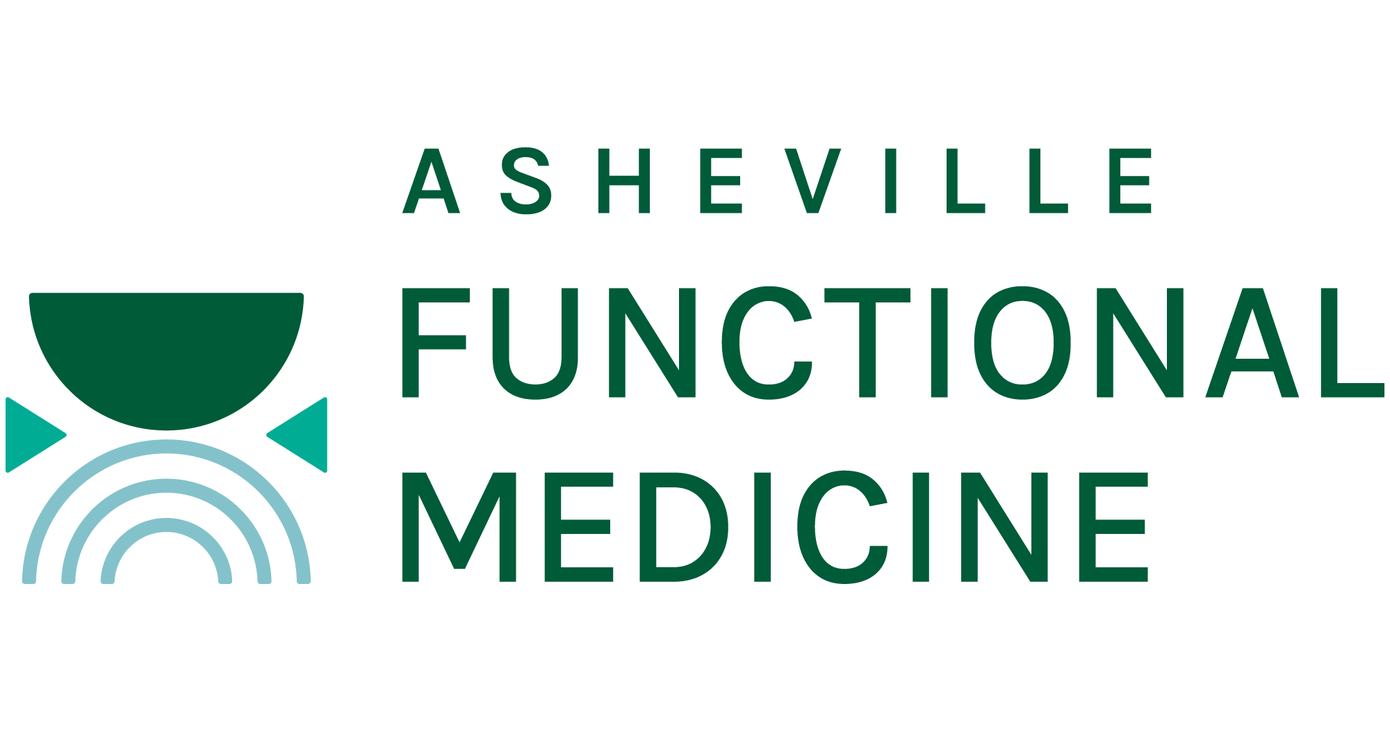

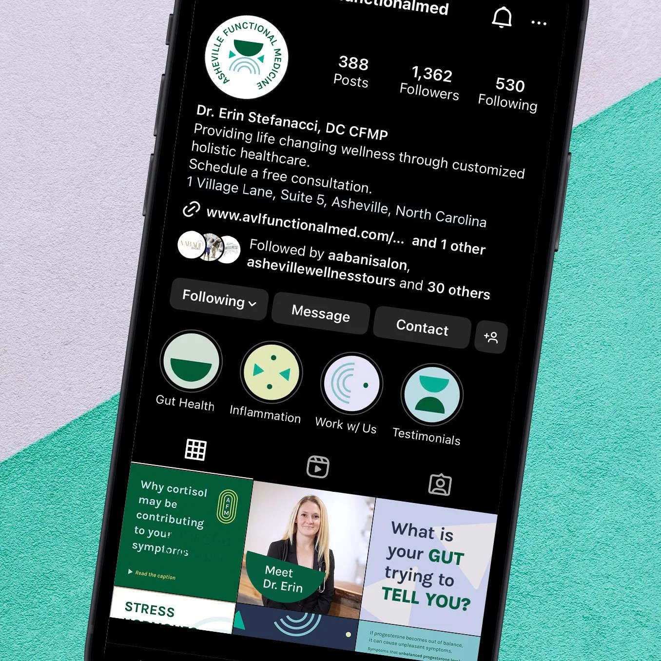
Working with Dr. Erin, she wanted to communicate her approach to functional medicine by balancing her holistic and science-based background. She wanted her logo to communicate how much solid support she provides for her clients throughout their health challenges.
In the logo, the solid semi-circle represents support and trust. The bottom rainbow-like semi-circle represents hope and togetherness, for a positive message of finding better health through a partnership with Dr. Erin. Together, they represented balanced treatment, as well as the balance found in better health. The triangles represent equilibrium, change, and movement towards better wellbeing.
I had so much fun designing this branding and leaning into abstract geometric shapes to communicate such a strong mood and feeling that attracts the right clients for Dr. Erin’s practice.

Ratliff Integrative Family Medicine: beautiful, nature-inspired branding for a direct primary care doctor

Dr. Melissa built her direct primary care practice around the core value of relationships, something that was integral to communicate in her branding.
The bee was an important personal symbol to her, which worked perfectly in her logo design as a symbol of working together with patients, building close relationships, helpfulness, and perseverance towards better health. The cone flower represents health and healing. Together, the elegant, badge-like symbol feels approachable and is the perfect blend of traditional and modern.
I love how this branding feels both soft and comforting while exuding confidence and strong support for patients.


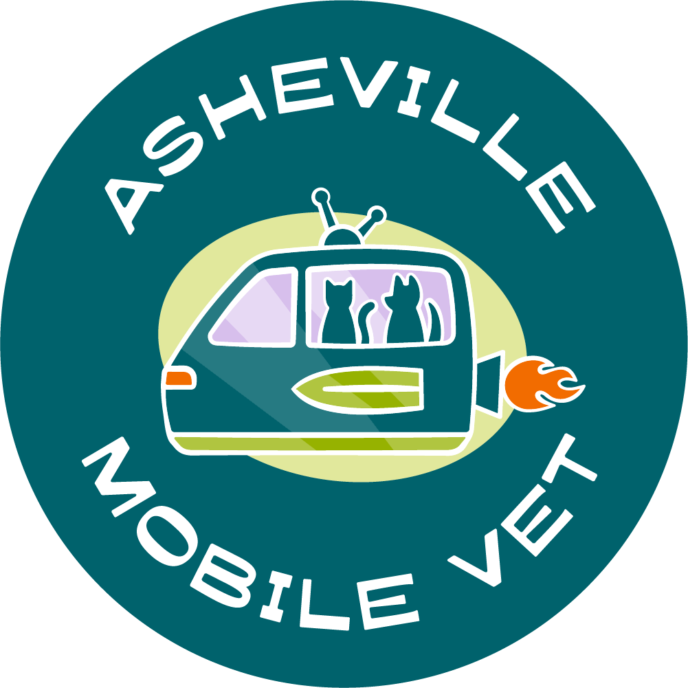
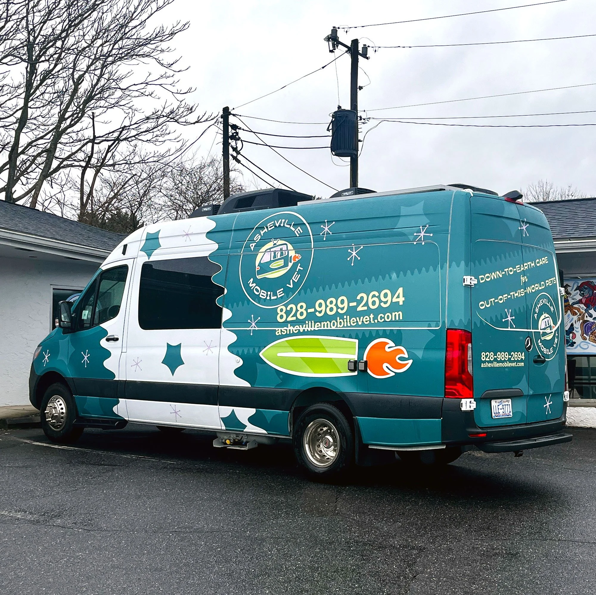
Asheville Mobile Vet: a bright, playful, retro-futuristic logo design for a mobile veterinary clinic
When Dr. Cate explained her vision for the logo and branding for her mobile vet practice, I was so excited to start designing (but rest assured we didn’t skip the strategic process!). Dr. Cate sees mobile vetting as the future of veterinary services, a theme we brought strongly into the logo design.
While the logo symbol is quite literal (a spaceship vet van complete with a jetpack and a dog and cat in the window), it is totally one-of-a-kind, and stylistically embodies the qualities and mood needed to attract good-fit patients. The design is approachable and fun, while professional and representative of the highest quality of care at the same time.
This is one of the most exciting and quirky brands I’ve designed, and I love how it retains a strong sense of professionalism and polish at the same time.
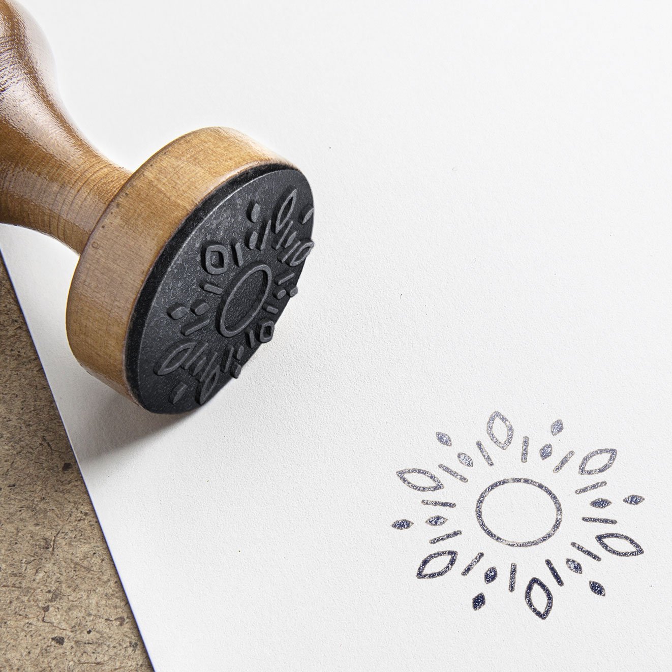
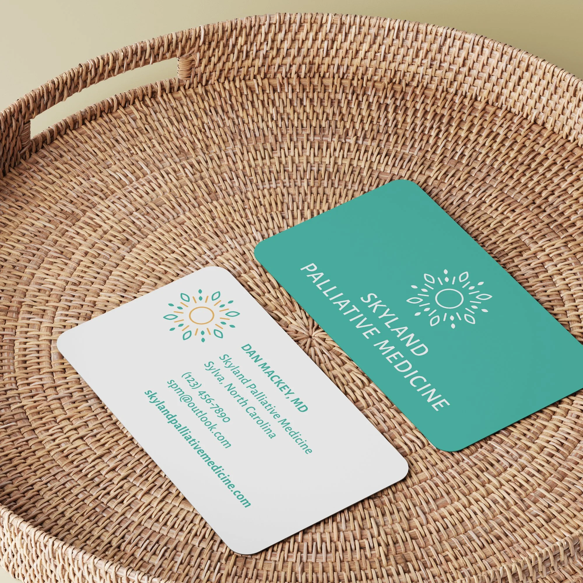
Skyland Palliative Medicine: a professional, elegant logo design for an end-of-life care provider
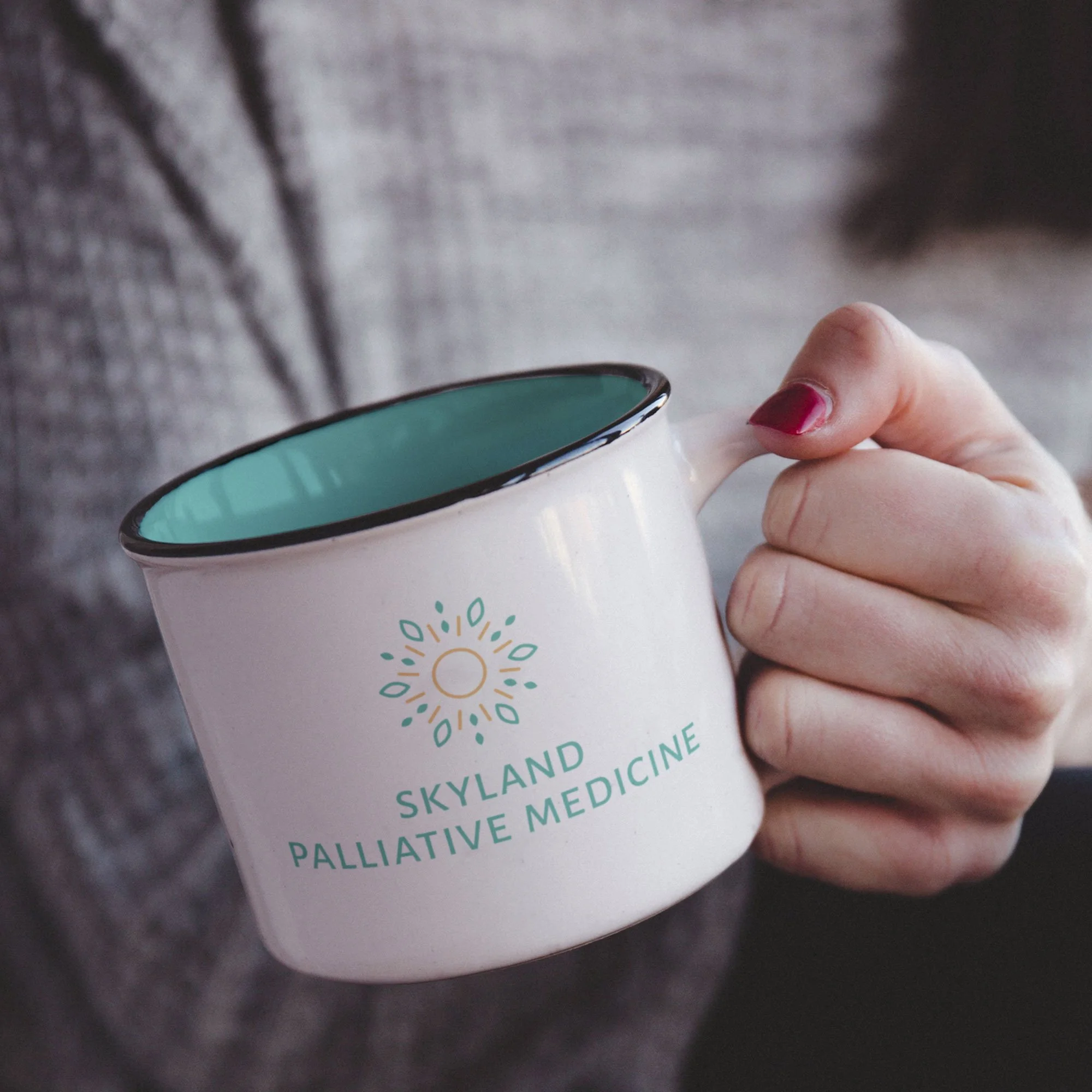
When people think of end-of-life care, it’s typically associated with an air of sadness. But when I first met Dr. Dan, he explained that even though palliative care is a serious topic, he wanted his brand to feel calming, inviting, and uplifting, helping his clients see the peace and positivity that will come from working with him.
His logo design feels soft and approachable. The sun represents warmth and comfort, and the leaves and petals represent quality of life. The way they connect in a radial shape represents Dr. Dan’s passion for connecting with his patients through listening and understanding.
Fun fact: this was one of the first logos I designed when I launched my business, and I was honored to be trusted to create the design for such a kind and good-hearted brand.
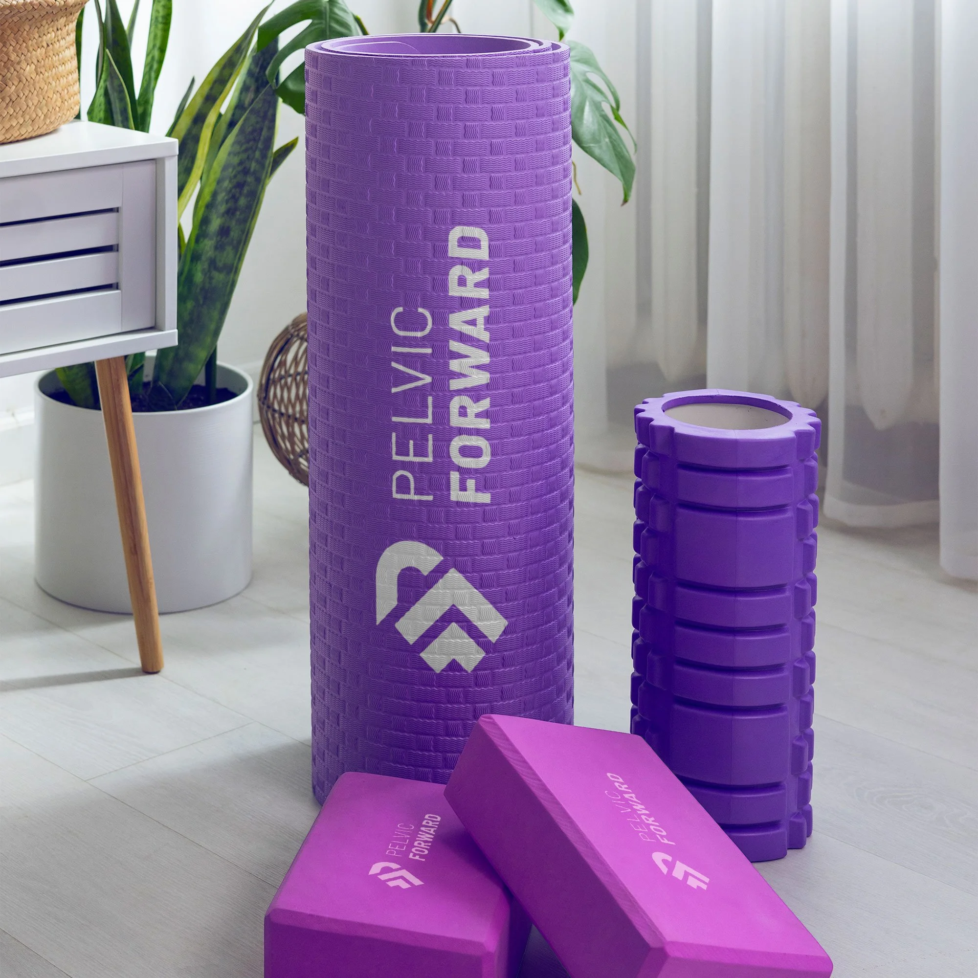
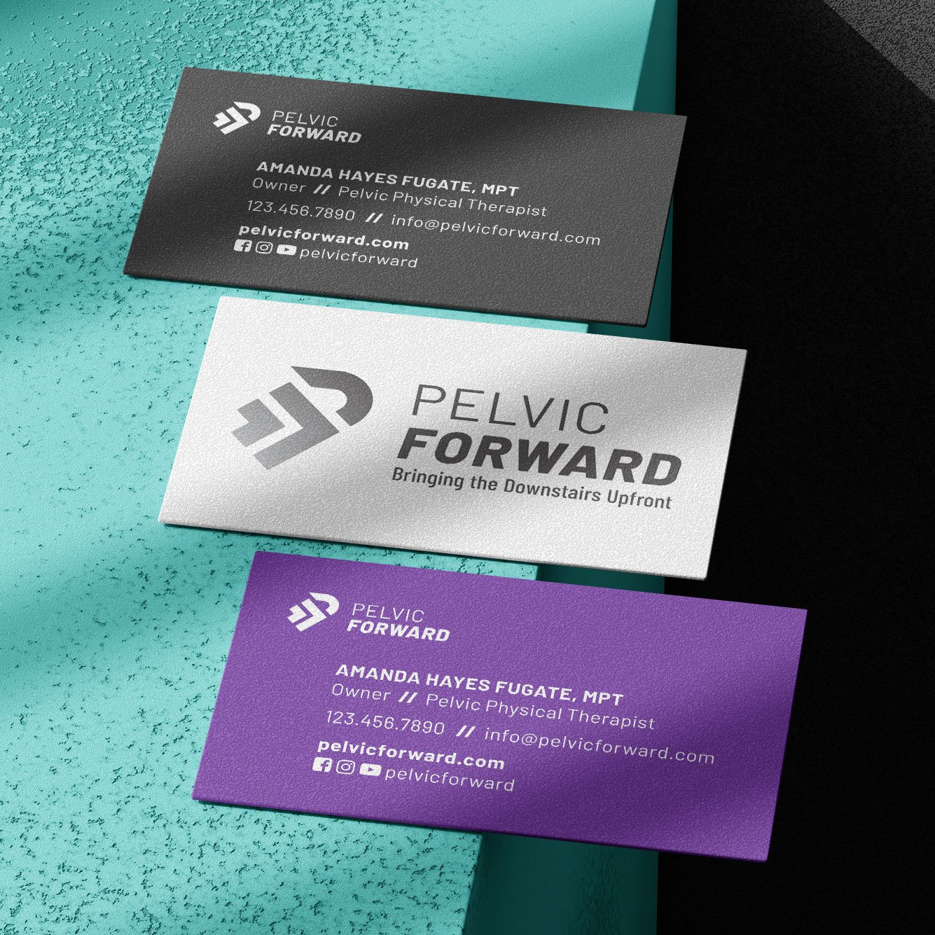
Pelvic Forward: a bold, movement-inspired symbolic logo for a pelvic physical therapist

One thing that stood out to me when working with Amanda was how incredibly passionate she is about her pelvic physical therapy work. In truth, every business owner I work with is, but listening to her talk about pelvic health, I could see how truly excited she is about sharing her knowledge with others.
Amanda wanted her logo design to feel strong and empowering, which we conveyed through a bold symbol that has a feeling of movement and driving forward with energy and commitment. The gradient and the arrows further this message and the concept of healthy progress.
Similarly to the previous logo, Amanda was another one of my first clients, and the first to hire me for both branding and web design at the same time! 8 years later, I’ve been a client of hers, as well, and it’s been a joy to keep in touch and see her practice continue to thrive.

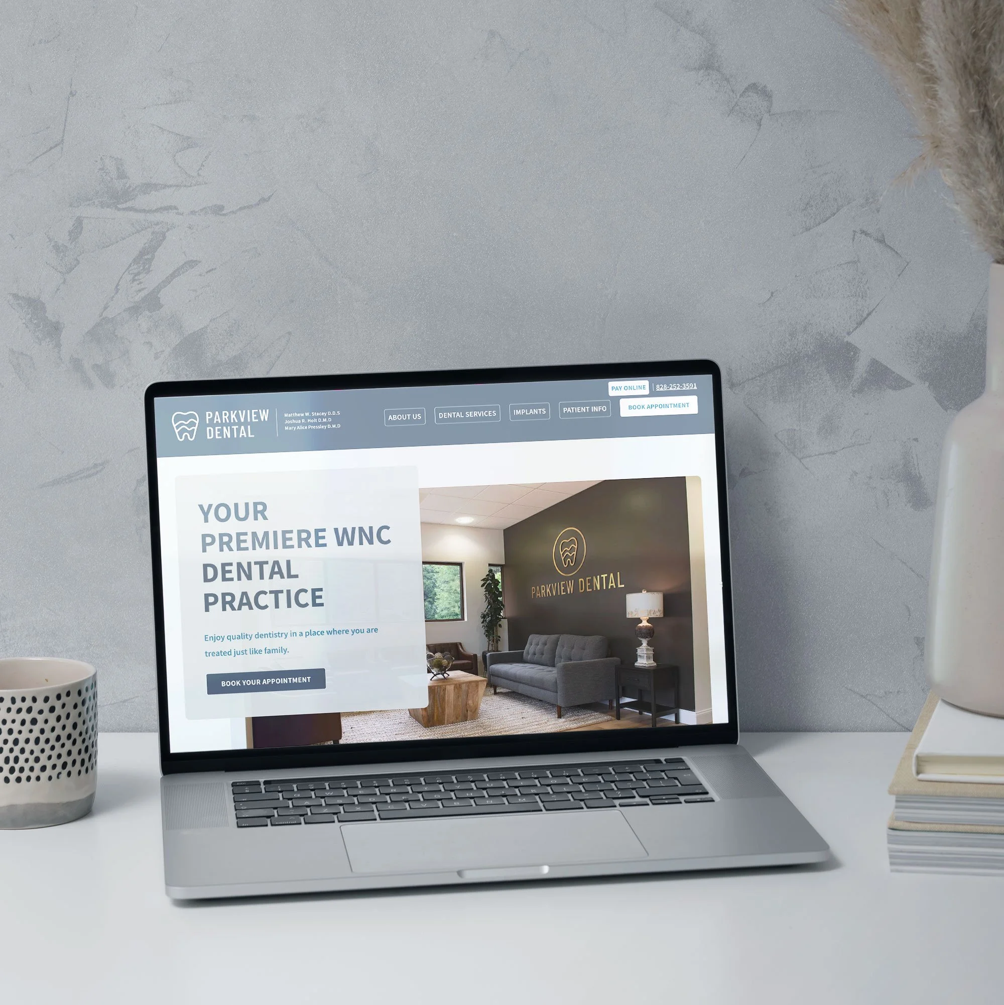
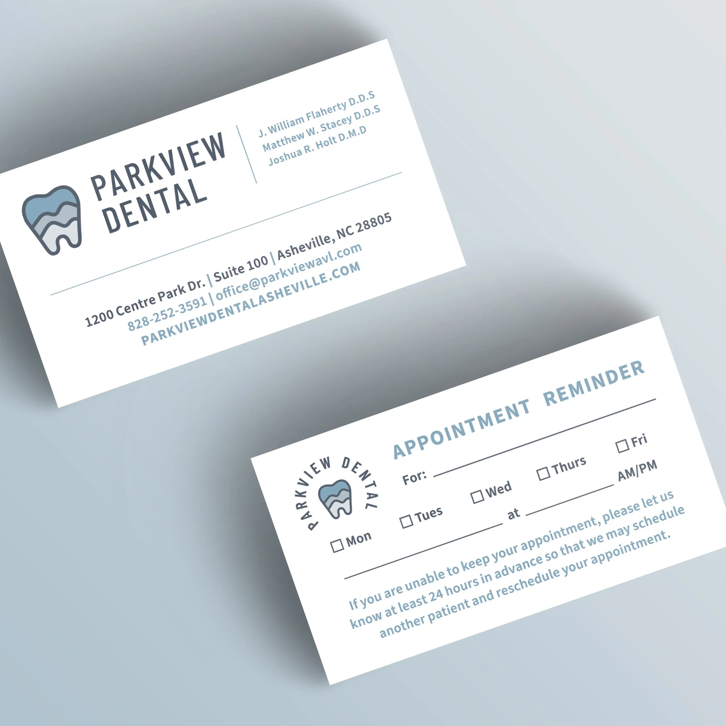
Parkview Dental: an approachable logo and brand design for a dentist that blends uniqueness with familiarity
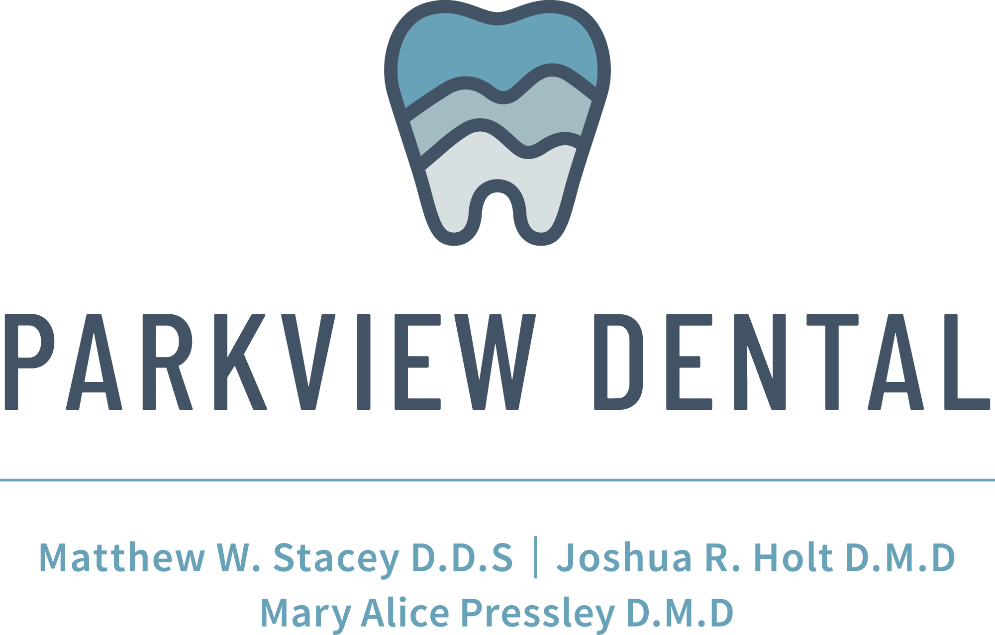
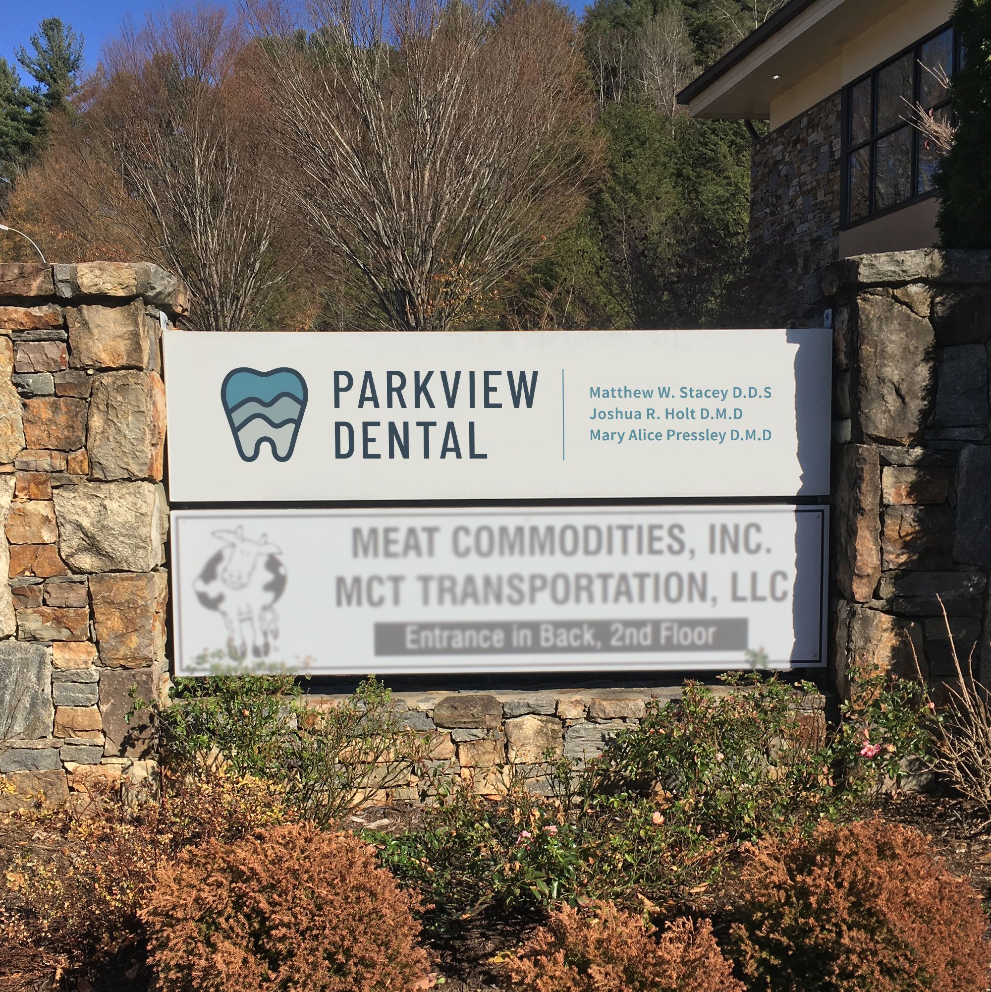
Dr. Stacey and his team at Parkview Dental reached out about a new logo and brand design when their practice underwent a name change. When we met, they explained how important it is to them that their patients feel comfortable trusting them.
The more traditional tooth shape in the logo is important, as the symbol is familiar and recognizable for patients that may feel on-edge about dental treatment. The rounded shapes and cool colors further convey a calming feeling, and the multiple layers of mountains represent both the practice’s mountain location as well as the variety of services they offer.
Even with a familiar symbol, your logo design can still be one-of-a-kind and perfectly-fitting for your core values and audience, and that’s why I thoroughly enjoyed balancing all of those factors in this brand design.
Why these healthcare logo designs work
As you can see, not one of these logos includes the first aid plus sign, a stethoscope, or a lotus flower, and they don’t need to! By embracing how each practice supports their patients and what makes them different, we arrived at logo and brand identity designs that are not just gorgeous, but do the work of attracting and converting their audience into clients.

Ready for branding that matches the level of quality you know you provide through your medical practice, and helps support your next big business goals?
Reach out here to start the conversation! I’d love to learn more about your business and goals.
Other posts about branding:



These 6 logos are great inspiration for stand-out branding for medical practices, each with a totally different spin.